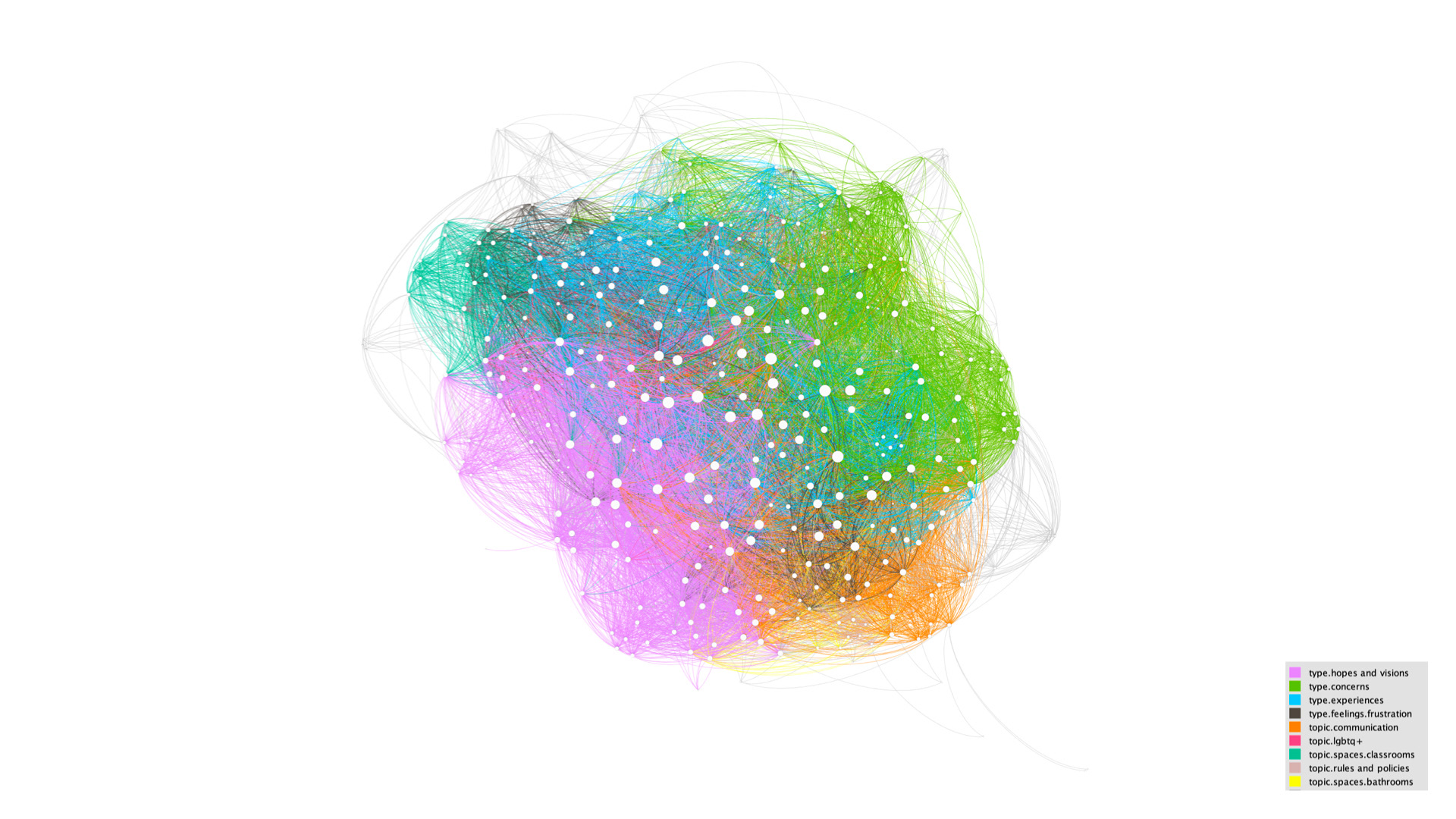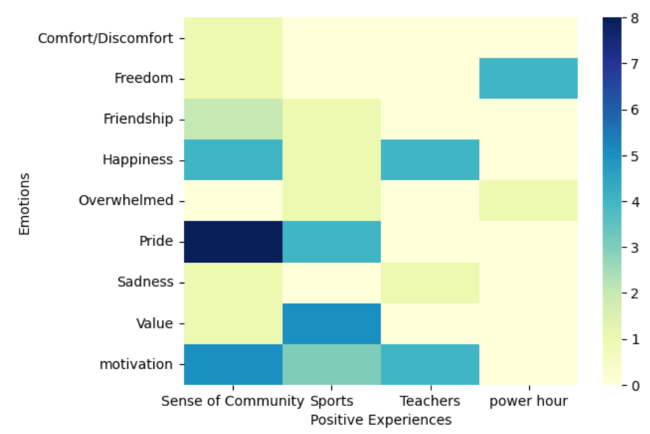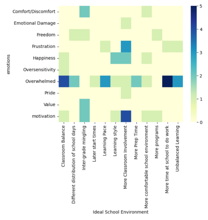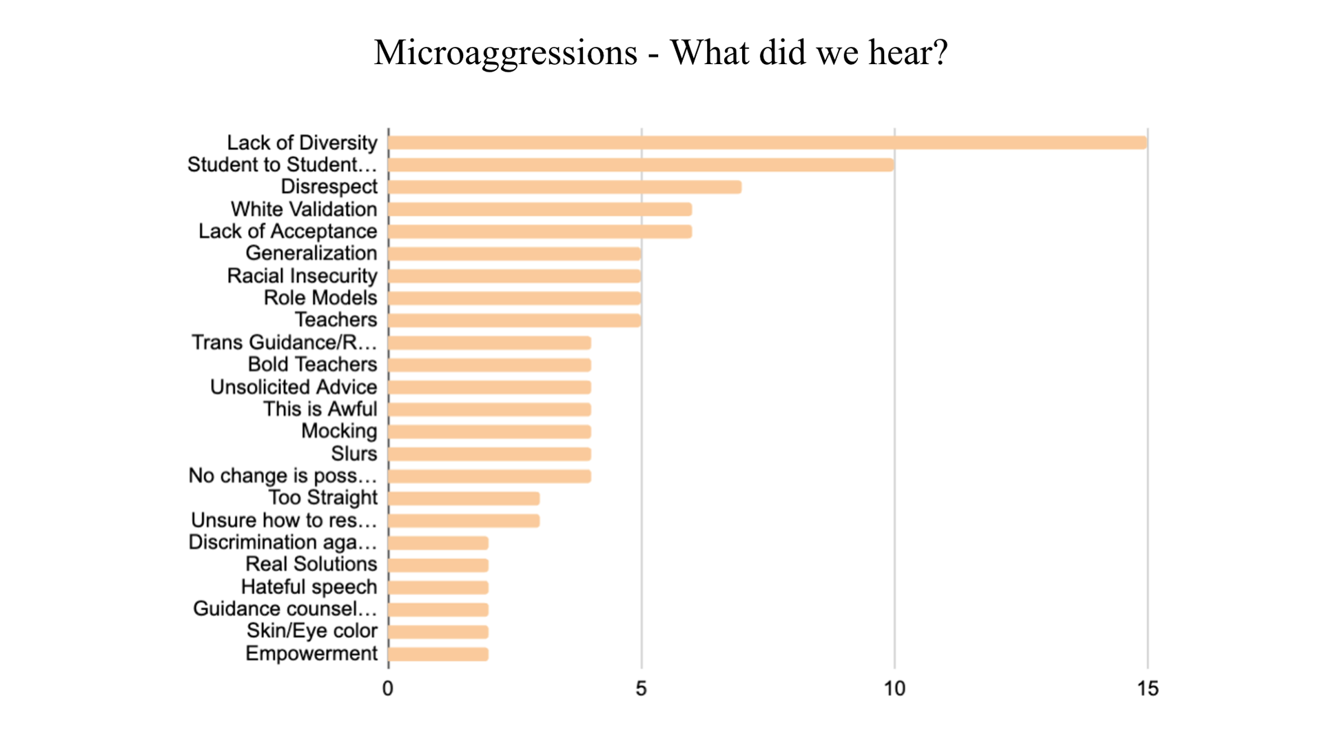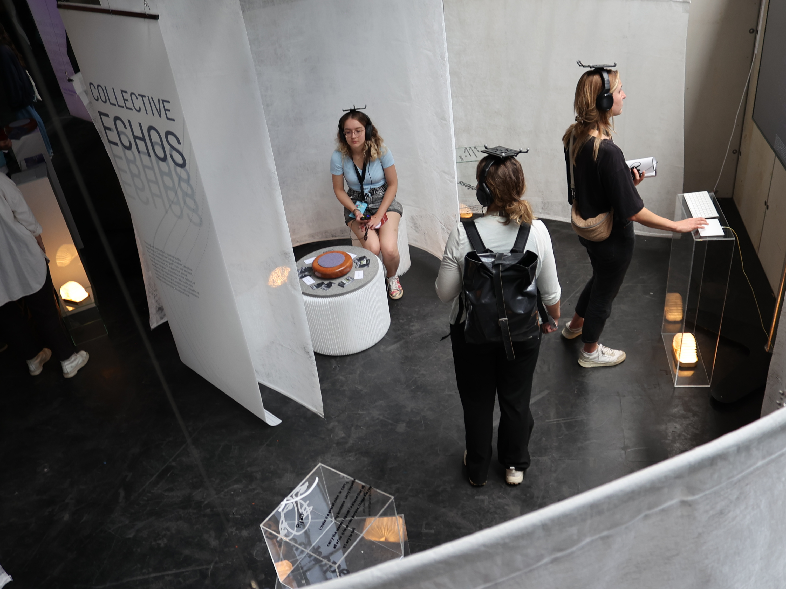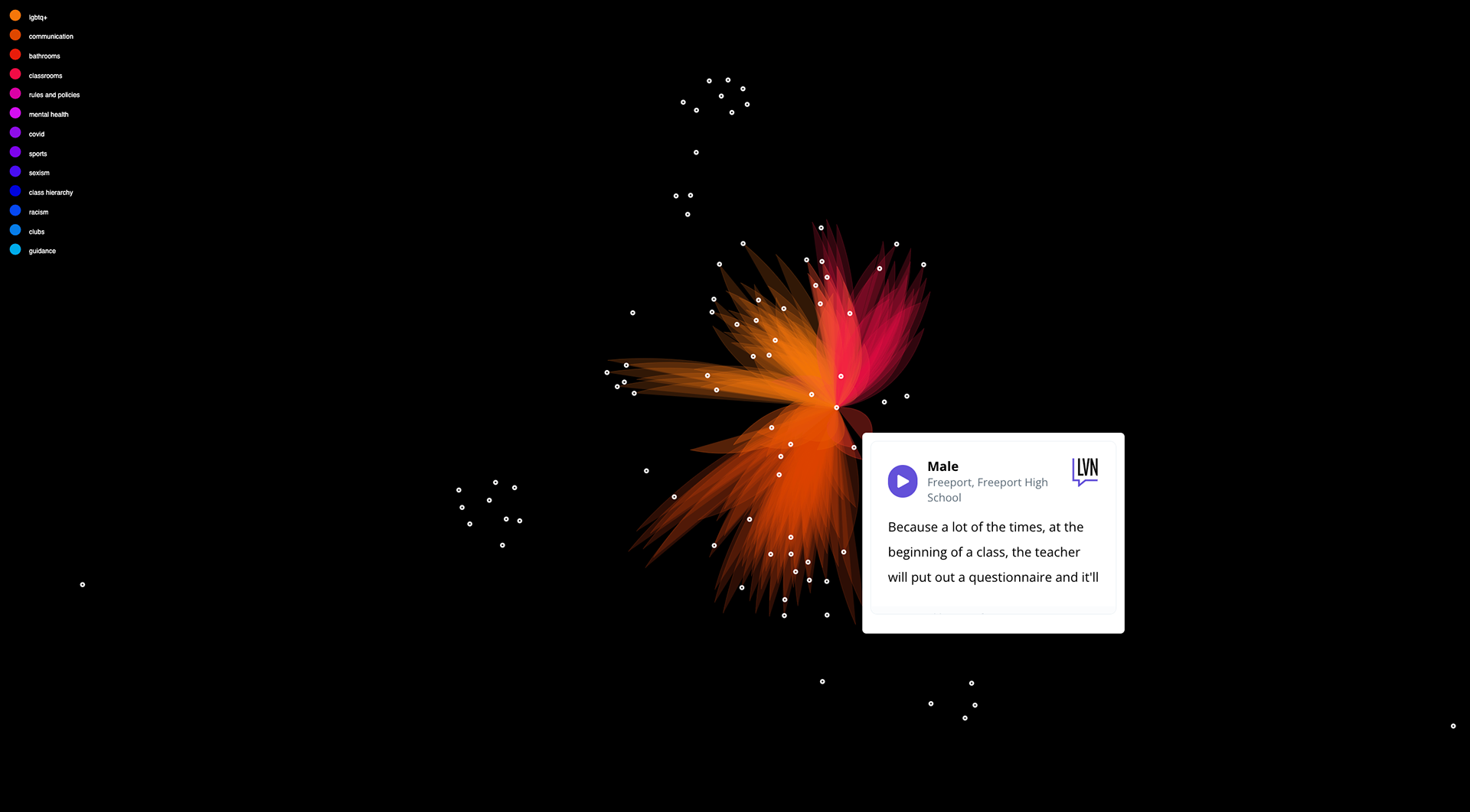
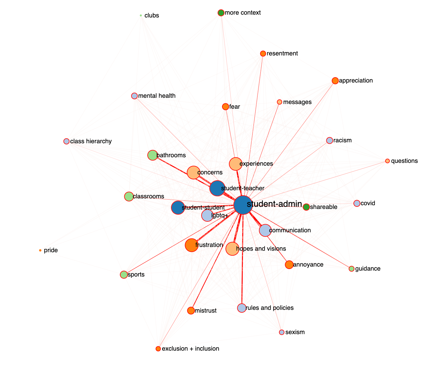
With 12 student leaders, we designed a conversation guide and held 12 dialogues with students about their hopes and concerns for their school prompted by hate speech in their bathrooms. With the students, we used participatory techniques to analyze and code the stories and dialogue data together. After developing a codebook and coding with the students, we developed a series of interactive data visualizations that showed the frequency of the different themes, the sentiments attached to each theme, and the connections between the different themes. We then designed and ran a workshop with the students in which we identified 4 areas of urgent need together. Samples of the interactive visualizations we leveraged to identify these urgent areas of need are below.
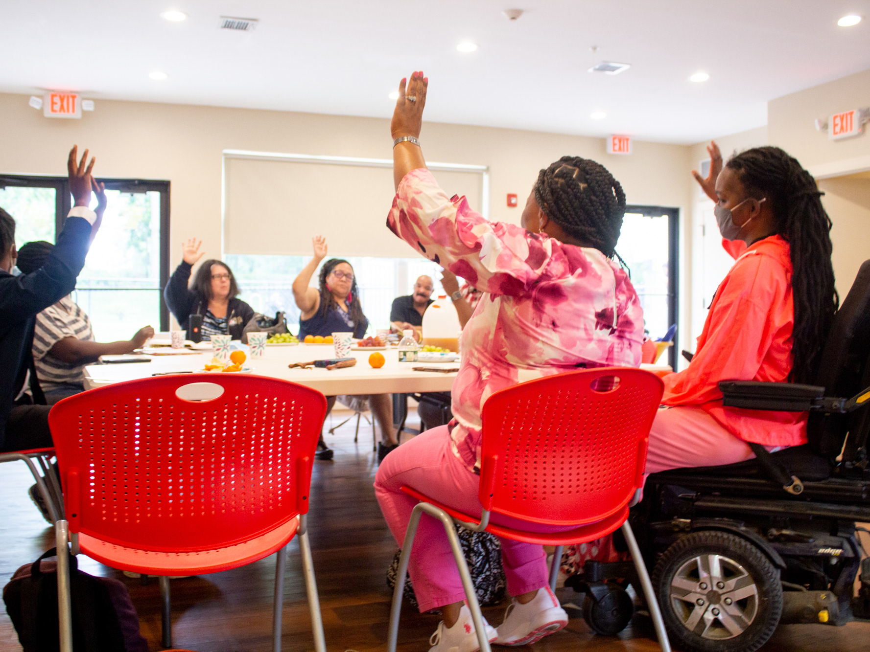
After identifying these areas, we developed a presentation in which the students shared their findings and advocated for action from the administration, snapshots of which are visible here. We are now developing working groups to share recommendations for action in these areas of urgent need.
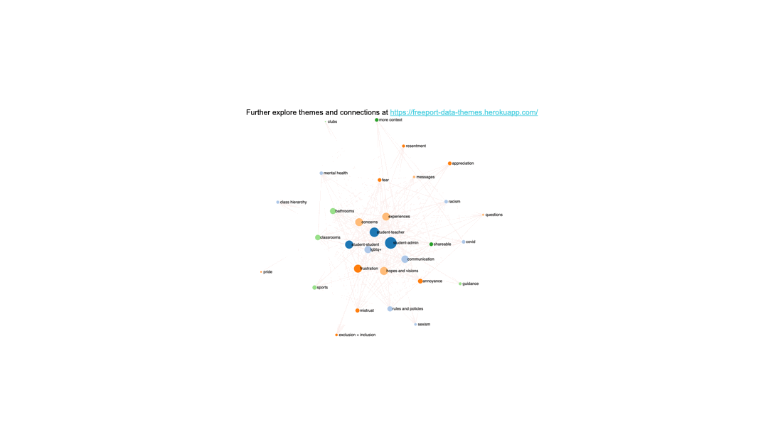
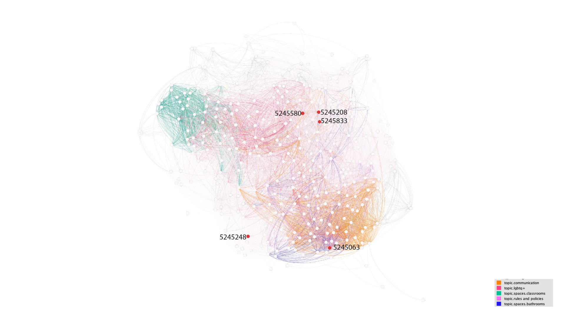
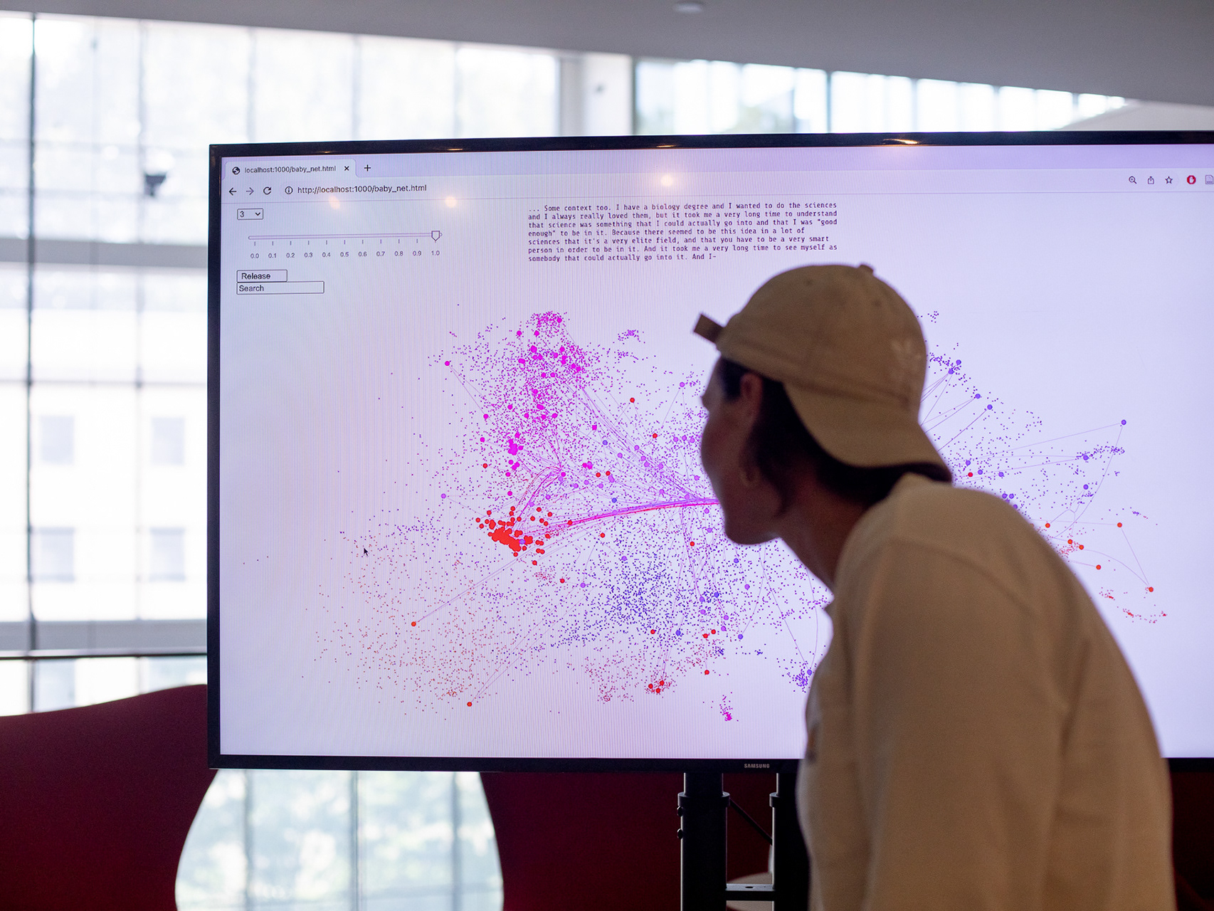
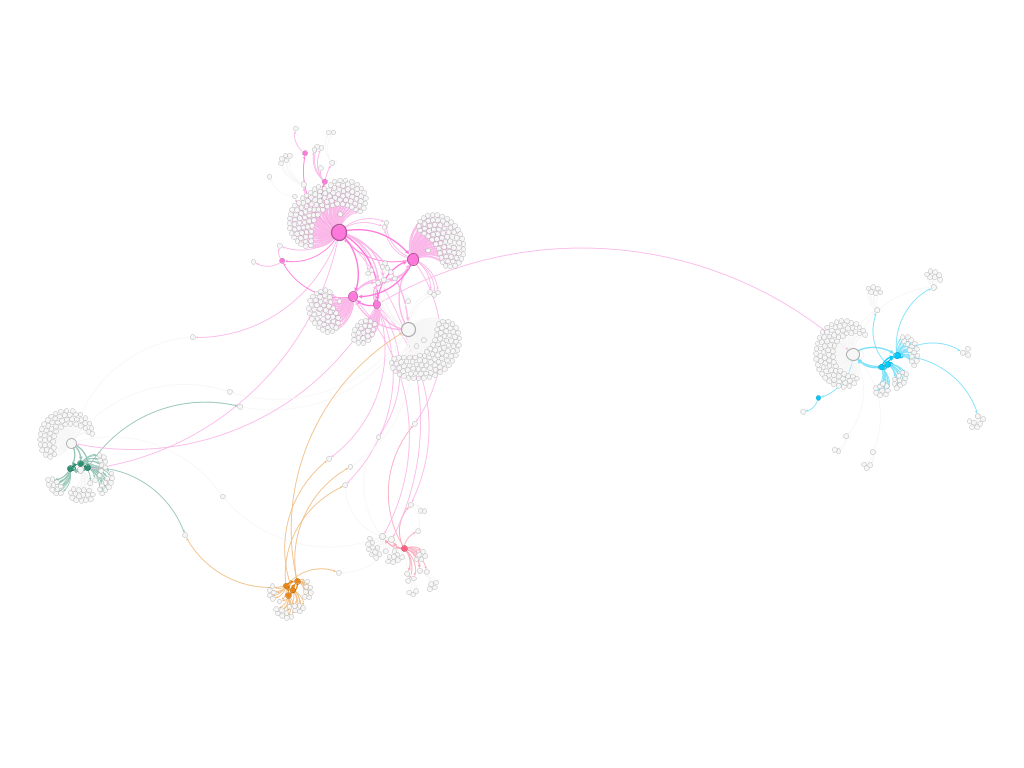
Further, we developed an interactive visualization in which you can explore each publicly available voice of the students, and see how that voices connects to the ons around it. In the following graph, each node is a voice, and each edge is a theme two voices share in common. We can see in the image to the right 5 voices students chose to uplift to the administration specifically, and where they fall in relation to their peers. Students and administrators alike found the visualizations useful tools for understanding the needs of the needs of the student body, while being able to see the whole system and broader context as well as seeing each individual voice and story to back it up.